Editorial
How European can it be?
Recently I was asked to position French, Portuguese, Croatian and Viennese architecture within a European perspective. I’m still waiting to be honoured with a request to do the same for a neighbourhood or a street. Such requests are, of course, a natural consequence of my involvement in this magazine, but the fact that I was asked the same question almost simultaneously for different parts of Europe seems to me indicative of a widespread desire to be judged in relation to one’s position within this new and evolving European constellation.
There are, however, no European championships in the field of architecture. And besides, I am not sure that I really know how French, Portuguese, Croatian and Viennese architecture should be viewed in relation to developments elsewhere in Europe. After four years of A10 I can say, without a trace of false modesty, that my knowledge of this area is still too limited to be able to oversee the entire region, stretching from Iceland to Turkey and from Portugal to Russia. In addition, and perhaps more importantly, I rather doubt the value of making national (or regional, or local) distinctions, which is a legacy of the 19th-century need to provide nation states with a national history as proof of their individual identity and uniqueness.
Of course, architecture is determined by economic, political, administrative and social circumstances, and these can and do differ per country, province or city (and sometimes even per neighbourhood or perhaps even per street). But national borders – which are often subject to change over the course of time – clearly do not always coincide with cultural demarcations. Many architects have an action radius and/or knowledge and interests that transcend national borders, which means that their work can, at most, be only partly assigned to a specific geographic unit or area. Related approaches, strategies, methods, models, forms, styles and modes surface in a great many locations and are less easily identified with a place than with a period of time. This was the case long before anybody had ever heard of a European Union, and it seems to be even truer today. (Hans Ibelings)
Inhalt
On the spot
News and observations
• Expo Zaragoza under construction (ES)
• Graeme Massie wins Reykjavik master-planning competition (IS)
• Transparent designs share first prize in PermMuseumXXI competition (RU)
• Update: Spring in Dublin (IE)
• Award-winning Museumplein in Amsterdam (NL) ripe for a makeover
• Reality check: Mixed-use complex, Budapest (HU)
• and more...
Start
New projects
• Office building, Sofia (BU) by Aedes Studio
• Shipping terminal, Herceg-Novi (ME) by Studio Grad
• Centre for the contemporary arts, Aberdeen (UK) by Brisac Gonzalez
• Two churches, Litomysl / Cernosice u Prahy (CZ) by Zdenek Fránek
• Academy of performing arts, bridge and square, Sarajevo (BA) by Archipelagos
Interview
Father and son Turányi
Within the changing Hungarian context, father and son Turányi combine their different approaches to architecture in their office T2a: „It is most inspiring when we have a continuous dialogue about our work. We need to be flexible“. An interview by Emiel Lamers.
Ready
New buildings
• Housing, Bilbao (ES) by Eduardo Belzunce, Juan Garcia Millán and Luís Diaz Mauriño
• Music centre, Watford (UK) by Tim Ronalds
• Covered sports ground, Jurmala (EE) by Substance
• Operational centre, Lisbon (PT) by GLCS Arquitectos
• Golf club, Sempachersee (CH) by Smolenicky & Partner
• Commercial and residential centre, Zagreb (HR) by Igor Franic
• Community centre, Dublin (IE) by Hasset Ducatez
• Housing, Stavanger (NO) by Helen & Hard
• Apartment building, Amsterdam (NL) by hvdn architecten
• Museum, Freiberg (DE) by AFF
• Pavilion, Grammichele (IT) by Marco Navarra
• Office building, Ankara (TR) by Cirakoglu Architecture
Section
Beyond transparency
The development of glass and architecture has for centuries been dominated by the pursuit of maximum transparency.But in recent years architects have been exploring and exploiting other properties of the material. Glass, always having been associated with fragility, is now being used as a structural material. Whereas the use of glass was for a long time problematical because of the associated overheating, special UV-resistant glass or glass to which a screen print or film has been applied, actually functions as a protective or light-reflective layer. And whereas glass once symbolized openness or even voyeurism, there are now all kinds of coloured, translucent and matt types of glass capable of delivering various gradations of openness or privacy.
Eurovision
Focusing on European countries, cities and regions
• Political symbolism: Monuments and history in the new Europe
• An architectural tour of the province of Tarragona (ES)
• Profile: ROBERTNEUN™ (DE)
• Home: Piotr Smierzewski’s clear and formal home in Koszalin-Lubiatowo (PL)
Out of Obscurity
Buildings from the margins of modern history
Daria Ricchi unveils Giovanni Michelucci’s 1950s Cassa di Risparmio in Florence, which is hidden behind a fake Renaissance facade.
Watford music centre
Tim Ronalds’ music centre is not your usual acoustic black box, in fact it is quite ethereal.
A lot of UK school projects today are big and fast; millions of pounds, often private money, are spent at great speed, aiming for a quick fix to decades of neglect. Many schools see their entire building stock replanned, demolished and rebuilt within a mere two years. All this was instigated in 1996 by then Prime Minister Tony Blair’s promise that „education, education, education“ would be item number one on the New Labour government’s agenda.
In the town of Watford, located north-west of London in the county of Hertfordshire, things are happening at a more measured speed. The local grammar school for boys has started an independent, step by step programme of building works, sponsored by its own fundraising. Ten years ago Tim Ronalds Architects embarked on a feasibility study for the school, and now its showpiece is ready. A four-storey music centre with a 200-seat auditorium is completed, as well as the less spectacular refurbishment and extension of its sports block. The relationship between school and architect seems to have flourished – more projects are lined up for the coming years, including the refurbishment of its theatre, gym and music block.
The atmosphere in the school is relaxed. This is in huge contrast to many of the Inner London state schools where security is so tightly controlled that in some cases pupils cannot move freely between foyer, courtyard and classroom, but have to ask their teachers to open locked doors with electronic swipe cards. In Watford there are no such measures. One can simply wander into the buildings where one encounters helpful staff and pupils.
The main school building of the Watford Grammar School for Boys is a simple yet sophisticated Neo-Georgian brick structure built in 1910, rising from a long rectangular footprint to a modest two storeys. It is a wonderful piece of architecture with panelled interiors and generous levels of light. Behind it stretch playing fields, embraced on either side by a handful of post-war blocks that form part of the school.
Tim Ronalds’ new music centre is located to the front of the main building, standing respectfully off-centre so as to preserve the view of the old brick facade. Ronalds clearly loves the old school building, for the way the bricks change colour in the afternoon sun, and for its composition of rectangular windows and oculi. Ronalds did not want to compete with the qualities of the brickwork or emulate its character. His music centre is clad in greenish glass, with bold openings cut into the envelope for windows and doors. Because of acoustic requirements music buildings often appear solid, and Watford’s declared aim was to create something transparent, even ethereal.
The building allows views out, and views between its internal spaces. Unusually, the auditorium is day-lit; there is a tall window facing out towards the school, another facing the building’s foyer, and a big rooflight above the conductor’s head. The composition and quality of light are convincing and somewhat ecclesiastical, reminiscent maybe of post-war church architecture.
The music centre was built as a joint venture; the boys’ school shares the building with the County Council’s music school which has its own offices on the upper floors. The Council sold off a piece of their own land on the other side of town in order to contribute to the costs. But the grammar school still had to stump up a considerable amount, which they did by selling off parcels of land at the edge of the playing fields where a private developer is now constructing some twenty houses. Fortunately the school grounds are so big that this sell-off has not impinged on the quality of the school’s open spaces.
The music building is now partly occupied and starting to come alive; the school is moving in equipment and holding classes in the building. There are small practice rooms and bigger classrooms, all grouped around a central staircase with elegant handrails – „It’s 1950s,“ says Ronalds – top-lit by another rooflight. Walking up the stairs, the visitor is surrounded by a multitude of sounds, while the wide corridors allow views into rooms where teenage boys can be seen improvising on the piano or trying out the drums – and behaving surprisingly well, given that teachers are not always in attendance. But who has time for mischief in the presence of such generous facilities and great equipment?
Tim Ronalds’ office specializes in performance spaces; three years ago it earned a lot of praise for the fine restoration of the Hackney Empire Theatre in East London to which it added a bold facade. Watford is a quieter building but it sits well on its site and works masterfully with light, both inside and on its subtly changing glazed exterior.A10, Do., 2008.05.15
15. Mai 2008 Cordula Zeidler
verknüpfte Bauwerke
Watford Music Centre
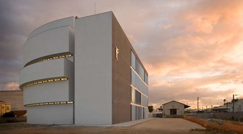
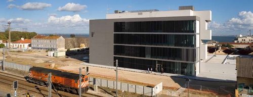
REFER operational centre
GLCS arquitectos translated dual programmatical demands into a distinctive curved-and-rectangular building.
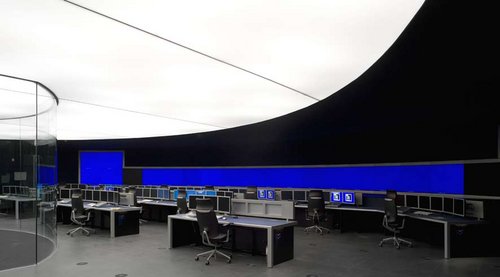
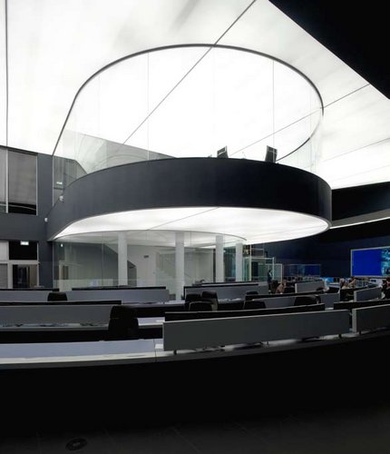
In classic philosophy, beauty exists only because we have a notion of ugliness, curves are understood in contrast with straight lines, enclosure as the opposite of openness, and so on. The Refer Operational Command Centre in Lisbon is a building of such contrasts. It houses the operational department of the company that manages the Portuguese railway infrastructure and is located near the urban railway station of Braço de Prata. This undeveloped area lies between railway lines, the river and former industrial buildings.
According to GLCS Arquitectos, the building’s designers, the starting point for the project was „the need to articulate both the technical and functional aspects of the programme and to integrate them in the finished building“. The given location was a triangular plot adjacent to the station. This new building, part of the „Refer Campus“, is destined to house all rail traffic control systems relating to train movements in the centre of the country. The technical complexity of this task was a key factor in the design of the building’s layout, especially the Command Room where the operators work with visualization instruments.
GLCS Arquitectos, a small Porto-based studio, have tried to establish a balance between an artistic approach and practical solutions. They designed the building as a composition of curved and straight volumes, both four storeys high and arranged around a central space containing stairs and elevators. The curved volume provided the ideal layout for the command centre’s operations. These require optimal light and heat control, which is ensured by the facade’s opacity. The horizontally displaced semi-circles of the curved body create voids that allow controlled, indirect sunlight to penetrate in the building, giving only a subdued reflection of the conditions outside.
In contrast to the closed character of the curved wing, the rectangular glass volume provides a good interior environment for ordinary activities – entrance and reception, amenities like washrooms, technical installations and horizontal and vertical circulation. This block works with different degrees of transparency, with vertical solar control blades covered with acrylic on both sides. This allows two-way glimpses of the railway station outside and control room inside. The louvres on the west-facing facades are painted black to block the entrance of sunlight. On the north they have a mirror coating that reflects a fragmented image of the trains and the station.
The building provides a good response to the duality of the programme by translating it into two completely different bodies – bright and dark, curved and straight, closed and open. Like life itself, in the end it’s always a question of balancing opposites.A10, Do., 2008.05.15
15. Mai 2008 Carlos Sant’Ana
Golf club, Sempachersee
Joseph Smolenicky realizes one of the first Analogue works.
With its most recent expansion, Golf Sempachersee near Lucerne became Switzerland’s largest golf course in terms of area. Driving up to the new clubhouse, architecture enthusiasts are reminded of an icon of Expressionist architecture: Erich Mendelsohn’s hat factory in Luckenwalde. Here too a massive „hat“ of a roof towers above an otherwise low body of a building. Initiates, however, also see another model: that of Analogue Architecture, a very influential theory developed in the 1980s by Fabio Reinhardt and his senior research assistant Miroslav Sik at ETH Zurich. The nostalgic gaze of the Analogues focused on architectural history and the homeland, rejecting the Modernism still predominating at that university. Hardly anything in the style of their designs, depicted in large oil-pastel paintings in great detail and gloomy tones, found its way into real life. This clubhouse by Joseph Smolenicky, first a student then an assistant of Reinhardt, can be regarded as one of the first built Analogue works.
The building enthroned high above Lake Sempach is expressive in appearance but was nevertheless conceived from the inside out. The shape of its ground plan is completely irregular, and the walls – painted a different colour on each side – lead a screen-like life of their own without right angles. They each run out from under the roof-hat’s brim and brace themselves against the slope with their slanted ends. These walls shape the rooms – half are reserved for club members, half are open to the public – around the large core. This contains the „back of house“, in particular the very spacious kitchen serving not only the two restaurants and a large, divisible hall, but also the conference room underneath, a total capacity of 450 guests. The roof-hat’s crown over the kitchen conceals the all the building services.
What a roof! The architect chose it because the client wanted the „atmosphere of a small Grand Hotel“. Although the building with its almost 60-metre length is not small, it is only one storey high, at least on the entrance side. Even so, the heightened silhouette lends, if not grandeur, at least power. The interior does justice to the pretensions of the sport of golf – in a very sporty style. Casual elegance is what you might call it in the world of fashion. Bold colours in good taste define the rooms; a lot of white-painted wood frames the surfaces and structures them, reading as joinery. Smoothness is nowhere to be found. The structures and patterns covering almost everything – such as the Oriental floral ornament in the red bar – pick up traditional motifs and bring them up to date with the help of furniture that changes from room to room. Backlighting the walls and ceilings of the restaurants and the lobby freshens and ennobles the familiar materials and forms, and accentuates the indoor surfaces vis à vis the fantastic view of the golf course, lake and mountains. There’s no denying that surfaces activated in this way seem oddly laboured, lose some of their substance, become visual background noise. Many an architect may not like that. Golfers, who have just spent hours on green expanses, maybe do.
A few hundred metres away from the clubhouse, the rectangular red wooden maintenance building, reprises the roof motif somewhat more calmly. Between the two is the low reception building which also houses a shop and the secretary’s office; this the architect merely altered. Linking all three is an asphalt path with very wide, white-painted borders curving dynamically across the green terrain. The path and the house bring many an image to mind – of the sea, wide open spaces, the New England of Edward Hopper – and not only on the splendid wooden veranda of the conference room. If there’s one thing this cheerful work by Joseph Smolenicky is not, it’s gloomy - in that respect it is miles away from its architect’s beginnings. According to Smolenicky, there is a common conception of a golf club and he wanted to sweep it away. He has succeeded. After this building, who can still say what a golf club should look like?A10, Do., 2008.05.15
15. Mai 2008 Axel Simon
verknüpfte Bauwerke
Golfclub Sempachersee